4 Questions To Ask When Optimizing Your Site For Mobile
As mobile use is becoming the most preferred method of using the Internet and browsing, in general, it is essential that companies are equipped to deal with their sites and information being accessed through mobile devices. Giving customers a great experience on their mobile devices is a must if companies want to survive in the industry.
The importance of marketing for mobile users may be obvious. Companies are more aware of what makes for a good experience for their customers but how can they make that happen? Deciding or recognizing where to begin optimizing a site for mobile can be very confusing when considering aspects such as the kind of device, the operating system, and the navigation methods.
READ ALSO: Push Notifications
Making a site compatible and better on mobile devices is unavoidable for companies. While having a mobile version is inevitable, it may not be necessary for each company to implement it right away. There are a few questions to consider before optimizing:
- Is the percentage of mobile traffic more than 20% of the total traffic on the site?
- Is there content on the site that users will be using or reading regularly?
- Are there products being sold on the site?
Answering yes to any of these questions means that there definitely is a need to begin optimizing for mobile use. Once the evidence has pointed to optimizing, there are a few more questions that should be considered in order for the process to work best.
Are The Form Fields Intimidating For Customers?
The forms that customers will fill out on phones are different than those that they will tolerate when using the full site on a laptop or desktop. Filling out a long-form on a phone is something that no one wants to do and is something that will probably not benefit the company or the customer.
Even with this information, many sites insist on using the same long forms that they would normally use with their mobile versions of the site too. This is done with total disregard for what the customer experience will be like. When this happens it is more likely that the customer will not fill out the form at all or will leave it unfinished.
This kind of long-form can be especially harmful to online businesses that require forms before the checkout page, or the transaction is completed. This is not to say that forms should be done away with completely, simply that they should be as simple as possible. Keeping it simple and possibly on a few different pages with very little information will make for a better conversion rate. This is a simple optimization fix.
How Will Your Site Deal With Slow Connections?
Something that many companies don’t even think to consider is the speed of the device that will be used to access their site when browsing. While many companies test their mobile site using a Wi-Fi connection, this is not the most used method of connecting to the web for mobile users. Most users will browse the Internet using their carrier’s network.
It is obvious that a slower loading time will decrease the revenue that a company can earn. Considering this, companies should attempt to connect to the mobile version of their site using different connections really to get a view from the user’s perspective. If the site loads quickly when using Wi-Fi but not 4G, then the site will need to be redesigned to reduce the time is takes to load and make it optimal for all users.
Is The Site Optimized For A Huge Number of Mobile Devices?
The sheer variety of mobile devices makes it nearly impossible to optimize a mobile site for all of the devices. There are literally thousands to consider. Some mobile phone makers have made it easier, like Apple. This company has made it easier to optimize for all of their phones rather than each one individually.
Companies need to consider that there are thousands of Android and Windows devices that will make testing the mobile site and optimizing it for all users very difficult.
This large number of devices also comes with their own variables. Other variables include the size of the screen, the speed of the processor, different browsers, etc. In order to best tackle this problem, companies should aim to optimize their site for the most frequently used devices, the iPhone and the Samsung Galaxy. Testing these more popular phones needs to be thorough in order to be effective and cover most of the bases.
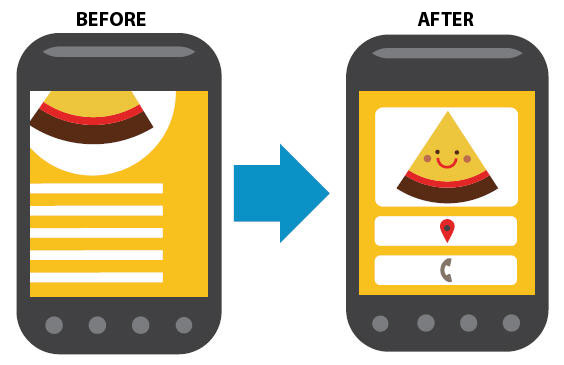
Is The Visitor Information Being Fully Used?
Companies that have a successful site for desktop need to recognize that optimizing their mobile site means considering that the actual user is mobile as well. When the user can move and access the site from different places, this will affect the optimization of the site. Considering the location should be one of the top priorities when a company is testing its mobile website.
Using location in these tests also means considering the location of the products, store, or business in some cases. It should be painfully clear where the store is, including how far away it is from the user, the address, and what services and products are available.
By providing this information and realizing that the customer could be accessing the site from any location, the site will help to reduce any anxiety the customer has about coming to the actual location of the business for services.
In Short
For those pressed for time, this is all the information in a nutshell:
- The mobile experience customers have is extremely important when most users will be accessing the site through mobile devices.
- Companies should put the user experience first in every aspect.
- There should not be excessive or unnecessary field forms for mobile sites.
- Load times should be optimized for different connections and different devices.
- The site itself should work seamlessly on many different devices
- Companies should take advantage of location information to better target and serve customers and users.
Want to receive reading suggestions once a month?
Subscribe to our newsletters