What trends will change the way we perceive mobile and web apps in 2018? Check out our predictions, tips, and tricks.
Who doesn’t like nicely designed things? Despite the fact that all people have different tastes and preferences, there are times when you can’t help but admire the sleekness or convenience of the product (or service) you’re using.
Considering the fact that life is moving at a faster pace these days than it used to for our parents and grandparents, user experience and user interface gain even more importance. Add to that competition on the market and the design might actually be the deciding factor for your users whether to download your app or use your competitor’s product.
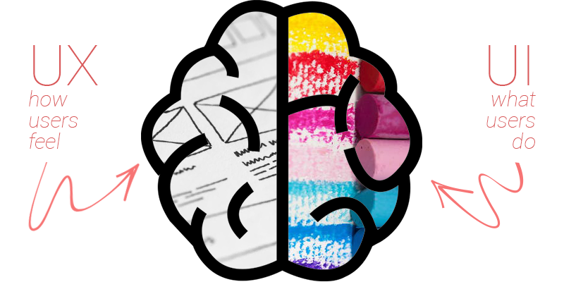
What is UI/UX Design and What’s the Difference
Let’s start with defining the terms so everyone’s on the same page. For simplicity, let’s take dinner at a restaurant as an example.
Content. Basically, this is the data you have for your project – whether it’s video content or articles, or e-commerce products. These are all the ingredients that make up your product.
UI – User Interface. This is what the users see and this is what most people think of when they hear of design. In restaurant terms, it’s your ingredients of a perfect dish arranged on a plate so it looks good.
UX – User Experience. This is one of the most misunderstood, yet critical, element of a product’s design. User Experience designers research user behaviors, delve a bit into psychology, and ensure that the user’s interaction with the product would be convenient and pleasant. Think of a dining experience at a restaurant. Your food might look wonderful and the ingredients are fresh, but if your waiter was rude to you or you had to wait for an hour for your dessert, then chances are that you’re not going to come to that restaurant ever again.
Why Is UX Design Important
As we already mentioned, the user experience is a vital element in deciding whether your client will continue using your product or will start searching for an alternative, more convenient way.
If your user interface design is nice and clean, the users might come to admire it. However, if your product is just pretty to look at and is not user-friendly, you simply won’t have a lot of clients.
UI/UX Design as the Start of Project Development
If you are a new business (or if you have started a new business apart from your main one) and the budgets aren’t very high at the beginning, starting with the UI/UX design part as well as Technical Documentation is a good idea.
Timewise, designs and documentation don’t take months to create (unless you have a very complicated project, but even then it shouldn’t take months.)
As a result of investing in these two initial steps, you get a tech spec you can use to find developers for your project (we’ve got good ones, just sayin’) and you get prototypes and wireframes to present to your investors in case they want to click and see what your product does (before you even have a product).
If you are considering presenting your product at events like WebSummit or Collision, then a prototype is a perfect solution for you in case you can’t invest a lot in actual development at the moment.
Trends to follow in UI/UX Designs for 2018
In case you’re considering ordering UI/UX web or mobile app design in 2018, here are a few trends to follow (or at least consider).
Content-focused experiences. Give your content enough room and don’t be scared of those white areas. Let it breathe so that your website visitors or mobile app users would actually get the information they came to you for.
Digital experiences, humanized. While Siri, Alexa, and other AIs are still gaining their more human behaviors, people are looking for humanized digital experiences already. Seek to simplify your processes on the user-side, so that navigating your app would be as easy as asking a friend for a favor.
Voice interfaces. Hello again, Siri, Alexa, and OK Google. With their SDKs available for developers, don’t neglect the ability to help your customers use your products when they can’t (or don’t feel like) type in the requests.
Augmented reality. One of the pioneers in this area was well-known Pokemon Go has taken the world by storm and users have found out the benefits of augmented reality. By now, there are a lot of examples of how AR can be implemented in various fields – from gaming to surgery procedures to translation (thanks, Google).
Fonts, colors, and personalization. Finally, seek ways to personalize your product for particular users. For example, it can be that for older people, your website would offer a slightly larger font or buttons.
The list doesn’t stop here, but for each industry, the combination will probably change. Above all, seek to simplify life for your users and help them get the desired results when they use your web product or mobile app.
And yes, just in case, we have an in-house UI/UX designer and awesome web & mobile app developers at the APP Solutions, who can implement all those amazing features that you want to have in your product.
Good e-commerce user experience is the key to success of an online shop. Besides good design, your store should be convenient for the users. Let’s talk about it.
Ever since The Internet became a thing, there was an urge to make a profit out of it. The most obvious way was to establish digital versions of the general-purpose and niche-specific stores. The logic behind is simple: if it a thing in the real world, why shouldn’t it be a thing in the digital realm?
At the very start, it was a gamble on every turn. The whole thing was an undiscovered country with no established conventions or winning formulas. But soon enough it became obvious that people love buying things online. More and more online shops appeared. And thus started the great industry known as eCommerce.
But for every eBay, Amazon, and OLX success story, there are numerous smaller e-commerce marketplaces that didn’t make it, even though the market segment was chosen aptly, the demand was high and the ambition was in the right place.
Why so? Part of the blame is definitely on the business strategy. But the other half definitely lies in the way those marketplaces were designed, the way their interfaces and user experience were composed. There was something missing in the design scheme that was putting off the potential customers at one point or another.
Considering that the competition in the eCommerce industry is intense and not exactly known for letting such things slip – it is usually utterly destructive to the nascent business project.
Let’s explain why it is so.
The Role of E-commerce User Experience
The design is reigning over our lives. Even if we are not really paying attention to it. Everything is divided into a grid of patterns that make our daily activities absolutely effortless and unnoticeably easygoing.
For example, the way you push buttons on your phone to get this or that result has a pattern. It is thoroughly thought-through, tried, and tested to be as smooth and seamless as possible. The same thing, even to a bigger extent, applied to web surfing in general, and eCommerce in particular.
Why?
Because we like when things are comfortable when every element of the page is conveniently placed and you don’t even need to think for a second to understand where is what and how to use it.
That is the way how human psychology works. And you can’t really go against it. You just need to embrace it. Even if it sounds like a darn truism. Because the opposite approach is… let’s say you definitely have yourself to blame for customers not purchasing products from your marketplace because they can’t understand how to do it.
We consider such things as marketplaces to be convenient by default. It is obvious, they are interested in customers making purchases and not thinking about how to get to the cart and finalize the deal. Customers like their service to be invisible and efficient. They don’t like to put any effort into things that are supposed to be smooth and seamless by default.
That where double-headed fella UI/UX comes around.
Do you know how Amazon and the likes make you buy things? It makes it easy to do and absolutely unnoticeable. That’s how it works. Ta-dah! And there is a method to this madness.
The way customers interact with the elements on the page is informed by certain patterns that make the process of consideration and eventual purchase engaging, satisfying, and ultimately fruitful for every involved party.
User Interface AKA UI is the key element in making everything fitting like a glove and ticking like clock. It is what the user sees on the screen when he’s doing things. It is what he can do on a particular page.
The perception of UI and its effectiveness is defined by User Experience AKA UX. These two terms go hand in hand. They represent two sides of the coin. Well-made UI makes UX so effective it is essentially a performance by the notes – exactly as it should be.
User experience is the hardest thing to pull off in any project. You never know how certain elements can be reacted upon. It also comes through tries and fails before the right combination is reached. Interface itself can be nice, but at the same time, it can impenetrable and confusing, which adds needless irritation to the mix and cuts off a considerable part of potential customers. It all brings us to the fact that continuous e-commerce UX audit is critically important because some things might work and some might not, and you need to know what works.
The thing is – the whole journey from landing on a marketplace page, starting looking at things, considering something, and an eventual purchase is divided into several points, each of them specifically designed from one into another – step by step. It is a narrative of sorts. And it needs to be easy to follow in order to effective.
Key Elements of Effective UI/UX in eCommerce Marketplace
While the whole process of figuring out the right composition of User Interface and sequencing of User Experience is highly dependent on a variety of factors and requires a considerable amount of testing, there are certain elements that require special attention. Below are the e-commerce UX principles you should pay attention to.
Landing Page Impression
That’s the place where the user journey starts. Your mission is to ensure that it will continue without missing a beat. In order to pull this off, you need to make a nice first impression.
Keep in mind, that the term “landing page” is not strictly about the homepage. It can be any other page – from the product page to a catalog listing. Because of that – everything should top-notch.
You need to make sure that potential customers will understand how’s, what’s and why’s of the page instantly. In order to test out the efficiency of UI, you can play out this scenario:
You are the user, you are looking for some product. For example, You land on a product page. What do you see? Do you understand what is this place? Do you understand how to operate it? How to move forward with the purchase or go back to the catalog listing? Do you understand the way the product page is organized?
Simple Navigation
Navigation is the thing that does not require a reinventing of the wheel. Even if you try, that will be an utterly pointless waste of time. Because you can’t beat the habit and years of homogenized navigation patterns. You just can’t. It is the way it is because it works.
But there is a catch. Navigation can be clumsy or confusing at times.
Here are several general points:
Every step must be justified – there must be a reason to do this or that;
Navigation logic should be obvious and easy to perform;
Every element should be easily identifiable;
Short and reasonable paths from one destination to another guarantee uninterrupted consideration of the purchase.
Familiar names of actions and destinations secure smooth and seamless movement from one step to the next. This means that you should refrain from using phrases like “Thou shalt buy this plate” or other Old English. Just let your BUY button say “Buy.”
Call-to-action Buttons
As a continuation of navigation, it is important to differentiate simple navigation controls from a variety of call to action buttons. Why? Call to action works when it is clear and present. If it is not, you end with no effect.
It also helps when the call to action buttons are clearly defined, well-positioned, instantly recognizable. In fact, if it is so, chances are they are going to be used properly.
Keep in mind that there must be a strict hierarchy of elements. If the CTA button is connected with the purchase – it must look one way. If it presents some additional information – it must look different. If it is a special offer of sorts – there must be yet another design. Customers must instantly differentiate where is what and how urgent it may be.
If done right, CTA will serve as a shorthand for the customer. It will map out the customer experience and thus raise the conversion rates significantly.
Search Bar
There is a reason why search bars look like white bars with a looking glass in the corner and situated at the prominent spot of the top center of the page. They are easier to spot that way. And you are interested in people being able to search for specific kinds of products on your eCommerce Marketplace.
Why so? It is obvious if a person looks for something specific, it means that person has an intention to buy it. And you can’t deny this opportunity.
Aside from a prominent position on the page, the search bar needs to recognizable as such. Aesthetic-wise, it means it should be contrasting with the rest of the page.
Also, don’t forget to add customization for the search request. That might help to narrow the scope of the search results thus make the process of spotting the right product easier.
The Checkout Screen
The checkout page is the nexus point of the entire site. It is where all the action happens and because of that, it is important to make it as effective and possible. How? By turning it into an engaging, instantly accessible, and streamlined process.
There are two options – fit everything into one page or break it down into a journey over several pages.
Let’s look at the pros and cons for both.
A major advantage of one-page checkout is that everything is here at once. It is faster to load that way. That’s about it with the advantages.
One of the biggest problems with one-page checkouts is the sheer amount of information you need to jam-pack into one page. Not only it is challenging to fit in a coherent manner, there is also a very legitimate threat that the customer will skip some element or make some mistakes. And that can be detrimental to the experience and ultimately harmful to your business.
Multi-page checkouts are trickier but there is more room for maneuvers. It is an all-around safer bet. Yet, it doesn’t mean you can stretch it out into a Moby-Dick. Keep it limited to essential two-three screens.
Division of the e-commerce checkout UX process into several steps can minimize the probability of the customer skipping something or making a mistake.
Here’s how it may be:
Login
Payment
Shipping (may be combined with payment page)
Review
Confirmation
The downside is that some customers can be irritated by sprawling checkouts which may result in them dropping off at some point.
Feature-wise, there are several elements that need to be present:
Simplified login – separate registration to the marketplace is a thing of old. It is a needless complication. Today it is far safer and much more comfortable to log in via email or social networks. In addition, keep registration is a foolproof thing, not every customer likes to do it due to a variety of factors, one of which is privacy.
Multiple payment options – modern times mean a multitude of choice options. In terms of payment, it means there must be as many payment gateway options as possible. You need to provide every possibility to the customer. It is important to keep the logos of all available payment gateways on a visible spot so that customers will instantly see them.
Security seals – online shopping is a very sensitive thing. Because of that, it is reasonable to provide every possible sign that your service is taking care of it.
Money-back guarantee / free refund – when it comes to money, anything can happen. That means you need to count on the bad stuff and as a countermeasure, such things as the money-back guarantee and free refund. It is always a sign of care for the customers.
“Save to cart” option – this one is mandatory. Just like the “Watch Later” playlist, “Save to Cart” allows sending the product to the cart without proceeding with the purchase from the get-go. This little feature allows uninterrupted user flow in the catalog and may result in bigger purchases.
Information needs to be presented in order to be perceived. Otherwise, it may go unnoticed and that may result in some sort of unfortunate situation, such as dropping off-site or not making a purchase.
Since the very way the pages are laid out affects the perception and subsequent actions of the customer – it is reasonable to keep it to the point without even the slightest chance of the user getting perplexed at any stage.
What does it mean for various types of the page?
For catalog and search result pages it means balancing out textual and visual elements. Sure, the picture must be big enough to be recognizable without an effort but the text also should be depicted in full so that there will be no mistake over the products. Also, if there is some sort of information (the product is sold out, out of stock, discount and so on) that must be addressed – it must be instantly visible and not hidden somewhere instead.
Product pages are trickier to handle as you need to find a way of putting the product images and list their technical specification in close proximity. The challenge is in keeping it readable while not taking over too much space. The product description is also often problematic as there is too much information that is often ignored even if it is something critical about the product.
Overall, there are several guidelines to keep in mind.
Important information goes to the front.
Each segment of the product page must be titled accordingly: title, size, technical specification, date of release and so on.
Each segment must be visually distinctive and not blend into one mess.
If there is some information in the product description that needs to be additionally stressed – use bold text. Instantly gets into attention.
In order to better understand how certain pages are viewed, it is better to study the patterns.
The last principle Page Reading Patterns
There are several patterns in which people read and browse certain pages. And that is something that can be used for the benefit of the website. The thing is – these patterns are fine shorthand in composing a layout for every page. They exemplify certain tendencies of page reading and show what can be done to counter it. For example, users are usually viewing left part of the page more often than the right. It makes sense to put there the information that matters.
Basically, what matters are the first lines of the texts, titles, subtitles. They receive the most attention and they usually play a decisive factor in users staying or leaving the page.
The most common is an F-shaped pattern. In the context of eCommerce marketplaces, it most commonly occurs on the catalog and search result pages. Here’s how it works:
Horizontal movement 1 – covers the upper part of the page, often includes navigation buttons and early parts of the content, including Title, lead-in paragraph;
Horizontal movement 2 – after that user moves down the page a little and reads across. The area is usually smaller than in HM1 but it is usually aimed at the “IT-factor” of the page that will decide whether the user will bounce off the page;
Vertical Movement – after quick run-throughs user more or less settles down and starts more thoroughly scanning the entirety of the page. Sometimes the movement can be cyclical with one round being fast and the other being significantly slower.
The problem with the F-shaped pattern is that it is unfocused and users mostly skip large chunks of information even if they are looking for it. Its meandering nature means you need actively disrupt it by inventive page layout.
Here are several page reading patterns that often occur on the product and checkout pages:
Layer-cake pattern. The user scans titles and subtitles and ignores the regular text (except for the visually distinctive elements). It is called like that due to a similarity of a heat map to the alternating layering of the cake and frosting.
Spotted pattern. This pattern is very tricky. It consists of jumping over chunks of text and scanning for something specific (for example, certain words, linked content, etc). Can be controlled by inventive layout and accentuation of certain bits of the text.
Marking pattern. This pattern involves keeping the eyes focused in one place as the scroll occurs. It is mostly a mobile phenomenon, so if you’re creating an app for a store – mobile e-commerce UX should be your guiding light.
Bypassing pattern. Instead of a thorough reading of the text users deliberately jumps to the thick of the text in search of valuable information. It is also a very common thing with the lists with many repetitive speech figures.
Commitment pattern AKA holy grail of reading patterns. It happens if you have managed to engage the user with the content to the point he is interested in methodical digesting of every single bit of it. Requires good content and adequate layout.
Knowing and countering these patterns is half the battle for a better user experience won.
Want to Learn More About The APP Solutions Approaches In Project Development?
Despite not being directly connected with the business side of things, UI / UX design is one of the defining factors in the successful development of an eCommerce marketplace.
It shapes the way the platform is used on every stage – from initial overviews to the purchase process. And as such, e-commerce UI / UX must be taken seriously, as their refinement or neglection can result in the marketplace’s subsequent growth or demise.
UI / UX done right is a fine foundation for growth and development while done badly it is a death sentence even for the most perspective idea.
Before you actually get down to creating your app design, make sure you remember what interaction design is really after. Its core principles underlie any kind of design whether it is meant for small-screen devices or the web. Let’s go through some basic rules of interaction design:
Clear goal. Understanding the goal of your design is a key. If you know your target audience, chances are you will make an app design that matches your customers’ needs.
App usability. Ideally, your app should meet users’ expectations for workflow and layout. This is what app developers call usability. If it’s an –easy-to-use, nearly intuitive app, more people will want to download it.
Use affordance and signifiers. While affordances indicate what your app can do, signifiers show how affordances work. Suppose your app gives an opportunity to like content, which is affordance, whereas thumbs-up or heart-shaped icon you should press is a signifier.
Make your app familiar. Even if a user sees your app for the first time, he should have a feeling as if he has already used it. This is called recognizability. It’s somewhat close to muscle memory when you intuitively know what button to press or where to scroll, etc.
Ensure instant response. Response allows users to see whether they have completed some task successfully. These can be a short sound or some graphical element. Whatever you choose, it should appear within the shortest time possible.
These are basic for any interaction design.
Define your target audience
In most cases, the audience will define your mobile app design. And these steps will help you identify your target audience:
Think about who might be interested in using your app. These are not real users but rather their most common archetypes that allow you to predict users’ decisions concerning your app.
Try to predict users’ behavior. If you have some clear picture in mind, it will be easier for you to design a UI that matches the users’ expectations.
These are major usability tests that will help you see how people will react on your app in natural surroundings.
Outline content
All the ideas in your app design are just vague images. Once you put them into a shape you will have a clear vision of the final product. Here, most app developers suggest that you start with an outline. This may not necessarily be some sophisticated design – simple sketch drawn on paper will be just perfect.
For this, you need to outline each page of your app. Draw the structure, layout and even minor elements to see the flow of different pages. Later when you have the full picture of your app pages in front of you, you can move to digital sketching.
All this is done to see how your content ideas will work.
Adopt common mobile design patterns to develop yours
All mobile app design patterns are dictated by the device itself and its specific characteristics like a home sensor or thumb button. However, there are lots of common design samples you can see nearly in every mobile app. These are swipe gestures or slide-out menu. You may use these patterns to enhance usability and later add some features that will make your UI design unique.
While it may sound like copying the design of others, it is actually a strategy that will help you get closer to the UX mobile design.
So where should you start? There are two major UI design pattern categories such as gestures and animations.
We live in a touch screen world and those who master gestures rule this world. However, choosing among swipe, slide, tap, press-and-hold moves, make sure that every gesture is appropriate.
Gestures combined with animations make user experience dynamic. But even with all benefits animation can give, one should be very careful using it. When there are too many motion effects, they can make users feel confused and disoriented. And similar to gestures, animations should consistently appear throughout your app and make sense.
Specific design for touch
Mobile touch screen directly influences UI design. People interact differently with their mobile phones and have different finger size. Therefore, it’s vital to consider these characteristics before designing your UI.
People may hold their phone with one hand and use one thumb to browse, or they may hold the device with two hands and use a thumb or pointer finger. People who hold a mobile phone with two hands and use two thumbs to tap the screen are also numerous.
Another important characteristic to consider is finger size for a touchscreen. Currently, it ranges from 47 to 57 pixels which is quite a wide space. However, if you design buttons too small or place them close to each other users will find it difficult to tap them.
Reduce the number of clicks
One of the web design rules holds that a user should make no more than three clicks to get the result if it takes him/her more moves, then such design isn’t effective.
While this rule may not be common for UI design, you still should consider it when developing your mobile app. Obviously, users appreciate apps that are time-saving and aren’t cluttered with unnecessary moves.
So think whether your app is crammed with tasks that users have to complete to get the result. If so, take a time to redesign your app. Perhaps you don’t need a good deal of pages that your app currently contains. If you users spend a little time thinking about what they should do, your app is likely to rank high.